ENG BELOW
PRABABA to projekt muzyczny trwający od 2018 roku. Zespół czerpiący z muzyki tradycyjnej, w składzie: Justyna Borys, Beata Małecka, Joanna Fuczko, Łukasz Dołęga.
Jako autorka projektu okładki do debiutanckiej płyty ŚWIT zespołu PRABABA jestem jednocześnie jednym z muzyków tworzących zespół, dlatego jest to dla mnie projekt zdecydowanie wyjątkowy.
Punktem wyjścia dla tworzenia muzyki są nas teksty i melodie tradycyjne krajów słowiańskich. Opowieści snute w pieśniach przez nas interpretowanych sięgają dawnych, często archaicznych czasów. Traktujemy je jak historie, do których podchodzimy z miłością i szacunkiem, a także przeświadczeniem, że każdy może dołożyć do nich swój wątek. Ich nastrój zmienia się więc i ewoluuje wraz z nami. W procesie tworzenia staramy się eksponować to, co dla nas ważne. Trwamy przy tym, co stanowi dla nas wartość i co jest nam bliskie. Jednak dajemy sobie też dużo swobody i przestrzeni na eksperymenty, co sprawia, że często sami nie wiemy, dokąd zaprowadzi nas proces tworzenia. Podróżujemy przez nieodkryte lądy i pozwalamy sobie na powolne ich smakowanie, poznawanie i doświadczanie. Głosy trzech wokalistek stanowią silny kobiecy pierwiastek, będący przekaźnikiem prawdziwej (pra)babskiej energii!
PRABABA/FOREMOTHER
PRABABA is a musical project ongoing since 2018. The band draws from traditional music and consists of: Justyna Borys, Beata Małecka, Joanna Fuczko, Łukasz Dolęga.
As the author of the cover design for the debut album ŚWIT/ THE DAWN I am at the same time one of the musicians who make up the band, so this is definitely a special project for me.
The starting point for creating music is us texts and traditional melodies of Slavic countries. The stories spun in the songs we interpret go back to ancient, often archaic times. We treat them as stories, which we approach with love and respect, and the conviction that everyone can add their own thread to them. Their mood therefore changes and evolves with us. In the process of creation, we try to expose what is important to us. We stick to what is of value to us and what is close to us. However, we also give ourselves a lot of freedom and space for experimentation, which means that we often don't know ourselves where the creative process will lead us. We travel through undiscovered lands and allow ourselves to slowly taste, explore and experience them. The voices of the three vocalists represent a strong female element, which is a transmitter of true (pra)female energy!
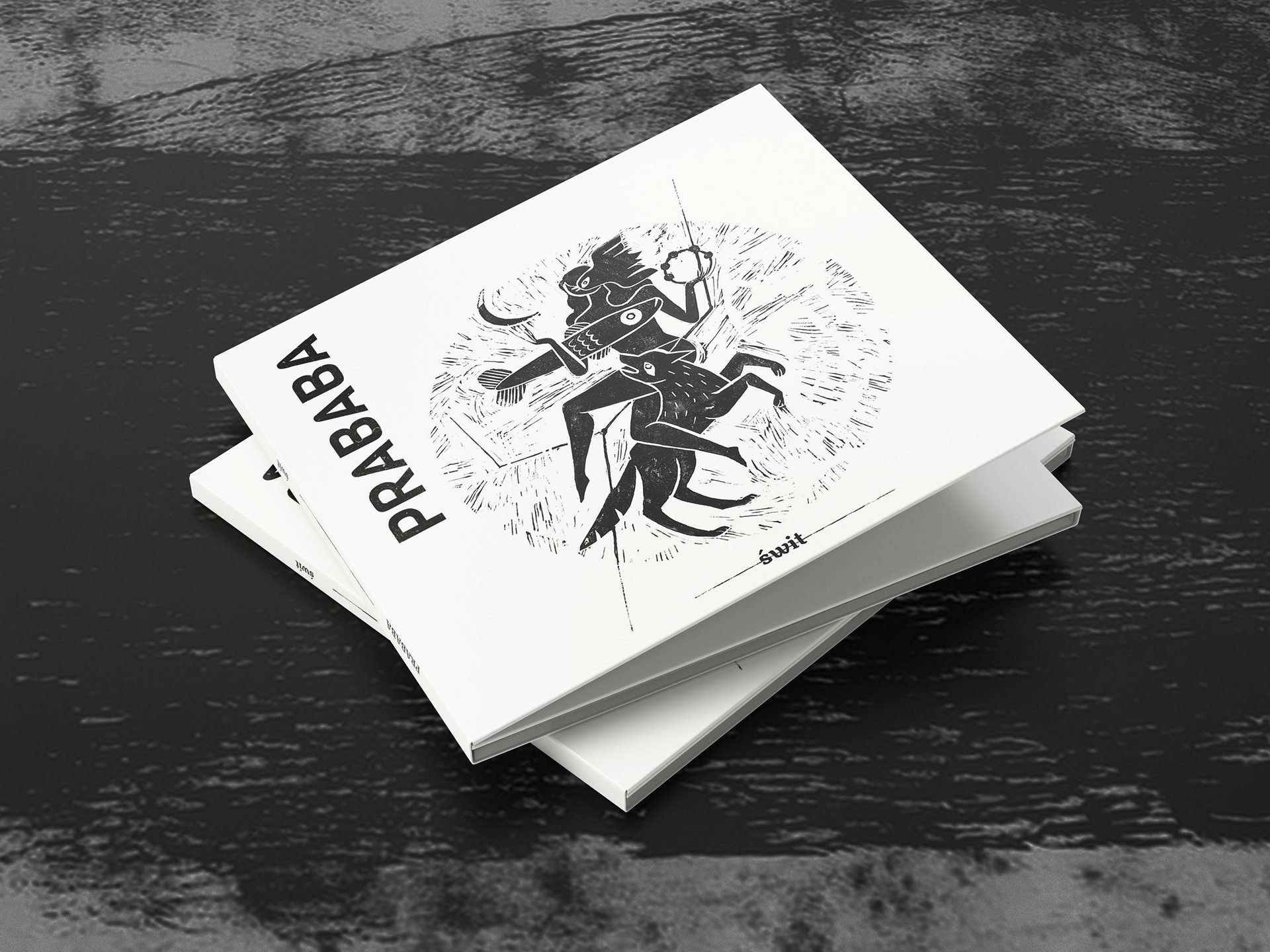
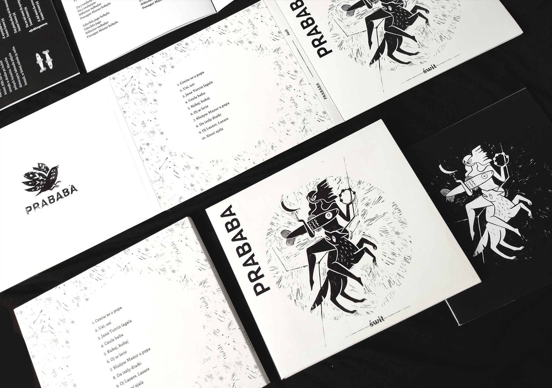
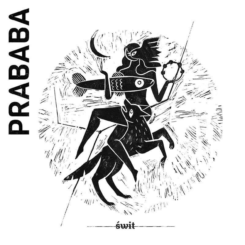
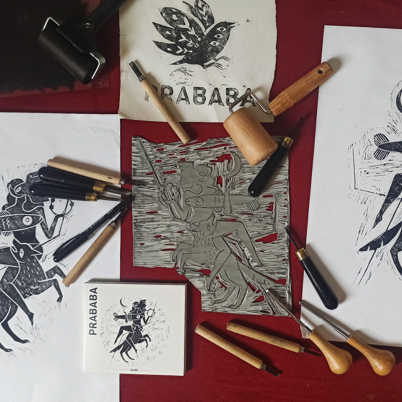
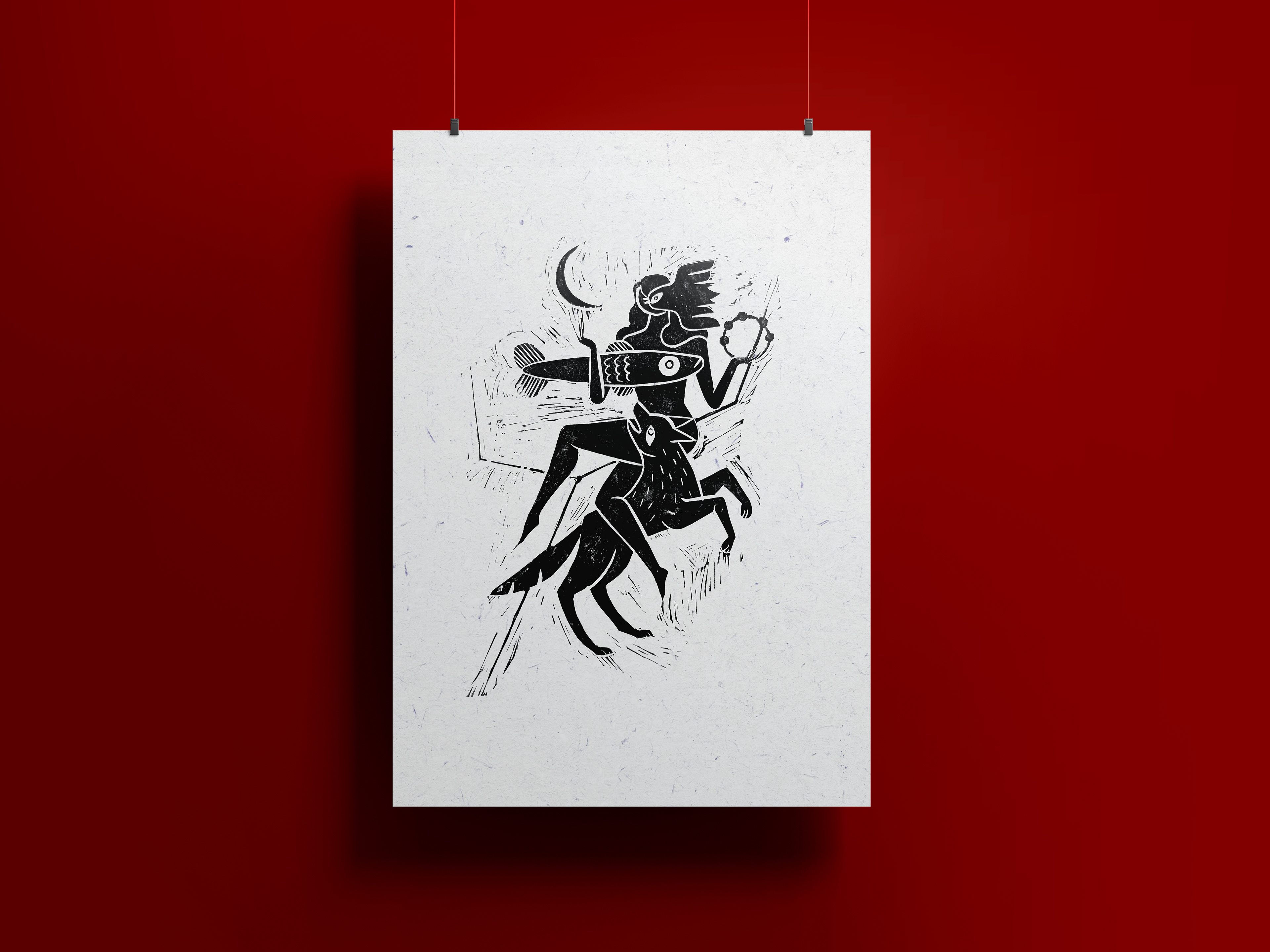
Właśnie takie archaiczne melodie grają mi w sercu najmocniej. Muzyka jest od źródła, surowa, czasami nieco dzika. Teksty zaczerpnięte z różnych kultur i zakątków świata (bałkańskie, łotewskie, ukraińskie) opowiadają zwykle o prostym życiu, dyktowanym cyklami natury, wędrówką słońca i księżyca, o uczuciu miłości i nienawiści. Stąd oszczędny charakter okładki bazujący na kontraście czerni i bieli, reprezentujących dzień i noc, które dzieli jedynie ŚWIT. W projekcie ilustracji dojrzeć można małe nawiązanie do logo zespołu — wszystkie postaci mają łącznie troje oczu.
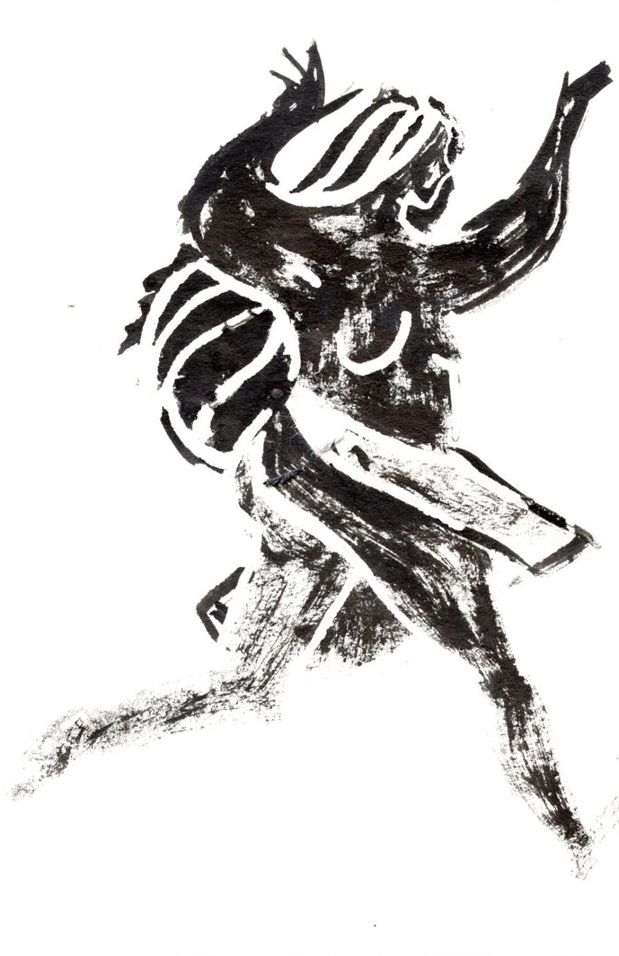
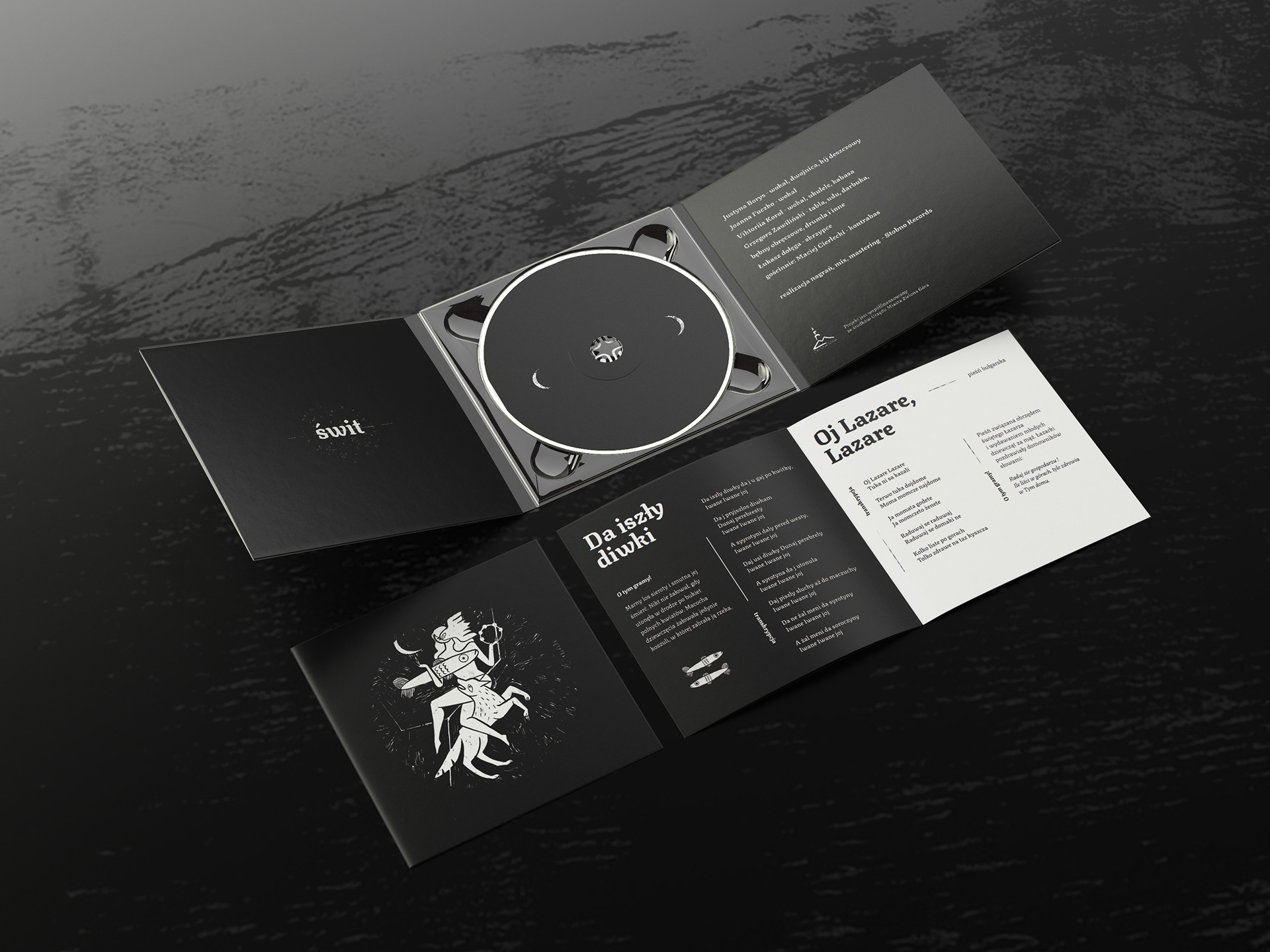
Najodpowiedniejszą formą dla zrealizowania projektu wydała mi się tradycyjna metoda linorytu, która pozwala na uzyskanie prostej, jednak szlachetnej grafiki co bardzo rezonuje z charakterem muzyki dawnej. W tej technice wykonałam również kilka mniejszych, ręcznie wycinanych w linoleum ilustracji, występujących w książeczce z tekstami tłumaczeniem pieśni. Ilustracje pojawiają się też jako rozwinięcie projektu w animowanej wersji, która posłużyła do prezentacji muzyki na YouTube oraz jako wizualizacje podczas koncertów na żywo.
-----
It is precisely such archaic melodies that play in my heart the strongest. The music is from the source, raw, sometimes a bit wild. Lyrics taken from different cultures and corners of the world (Balkan, Latvian, Ukrainian) usually tell about simple life, dictated by the cycles of nature, the wandering of the sun and moon, feelings of love and hate. Hence the parsimonious nature of the cover based on the contrast of black and white, representing day and night, which are separated only by the dawn. In the design of the illustration one can see a small reference to the band's logo - all the characters have a total of three eyes.
The most suitable form for the realization of the project seemed to me to be the traditional linocut method, which allows for a simple, yet noble graphic, which very much resonates with the character of early music. In this technique, I also made several smaller illustrations, hand-cut in linoleum, appearing in a booklet with lyrics translations of songs. The illustrations also appear as an expansion of the project in an animated version, which was used to present the music on YouTube and as visuals during live concerts.
The most suitable form for the realization of the project seemed to me to be the traditional linocut method, which allows for a simple, yet noble graphic, which very much resonates with the character of early music. In this technique, I also made several smaller illustrations, hand-cut in linoleum, appearing in a booklet with lyrics translations of songs. The illustrations also appear as an expansion of the project in an animated version, which was used to present the music on YouTube and as visuals during live concerts.